Condo Transformation
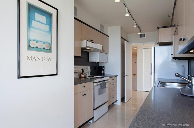
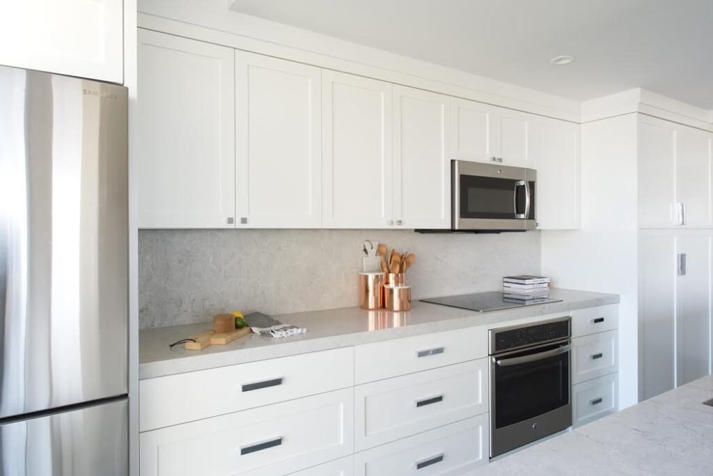
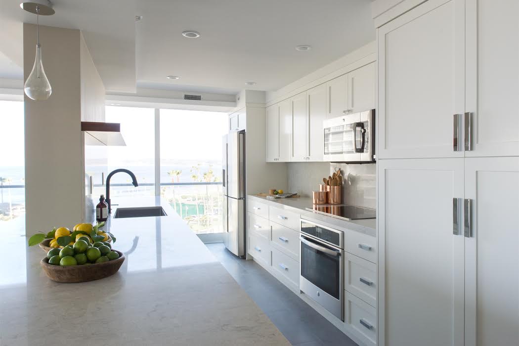
When we first walked into this condo it was outdated, closed off and had carpet (if you know us we have a strong aversion to carpet). Our design challenge with this space was to maximize the gorgeous view of the pacific ocean while making sure we didn’t lose any storage. In the kitchen we bumped the wall into the bedroom on the other side to capture more counter space and a place to tuck the bulky refrigerator so it was out of the sight line. We lost some upper storage but extended the kitchen island into the living area and wrapped it around the wall by the sink creating storage on both sides.
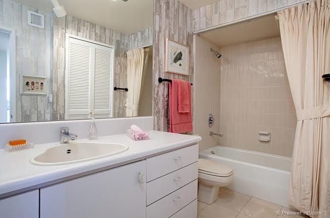
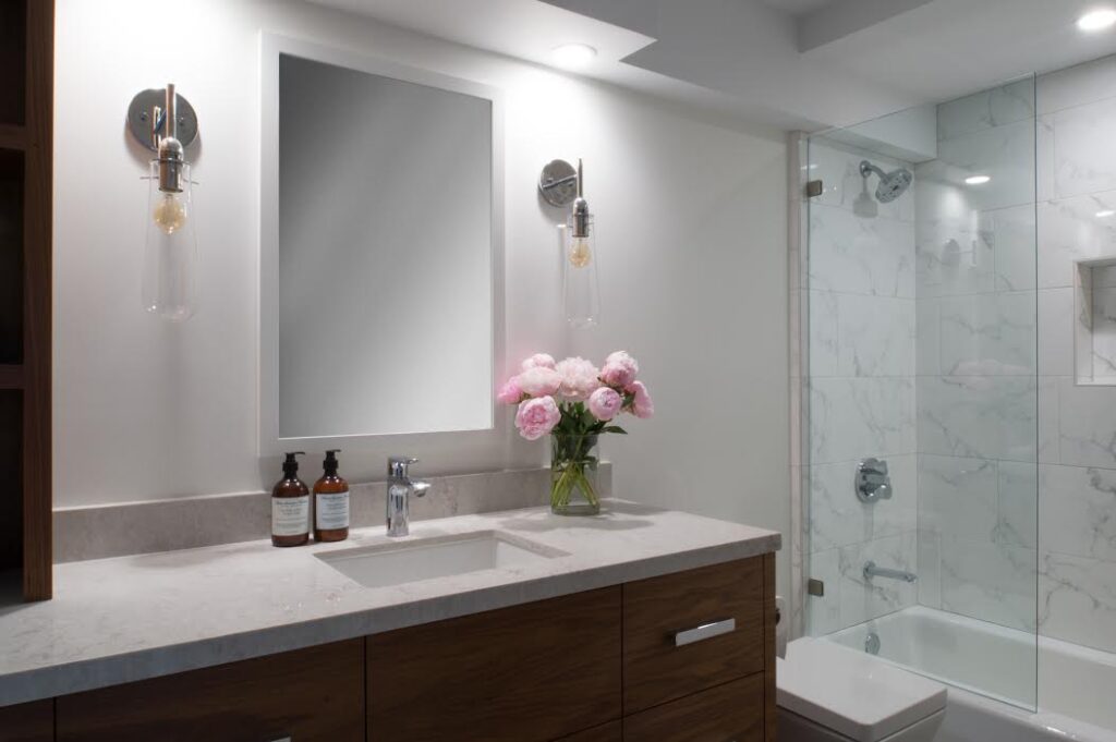
The bathroom had a long low vanity stuck in the 80’s which we replaced a gorgeous walnut vanity with a tower of storage for towels and accessories. The color palette for this condo was light and bright and we love how this space came together.


Add a comment
0 Comments